01
CRM Dashboard for Sales Teams

Project Brief
Design a Lead Dashboard for a CRM product, the central hub where sales reps manage their pipeline, monitor KPIs, and stay on top of tasks.
Problem
Sales reps often struggle with fragmented tools and cluttered dashboards that bury crucial information under layers of data. Without a clear system, priorities become blurred, follow-ups get missed, and opportunities slip away. Managing dozens of leads at different stages is overwhelming when metrics and tasks are scattered, while poor mobile usability makes it difficult to act quickly on the go.
02
Process
User Research
What is a CRM and why it matters
A Customer Relationship Management (CRM) system is the backbone of modern sales operations. It acts as the single source of truth where businesses track their customer interactions, manage leads, and monitor performance. Without a CRM, sales reps often rely on scattered spreadsheets, emails, and calls, which makes it hard to build consistent relationships or spot opportunities at the right time. A well-designed CRM saves time, creates visibility, and ensures that no lead falls through the cracks.
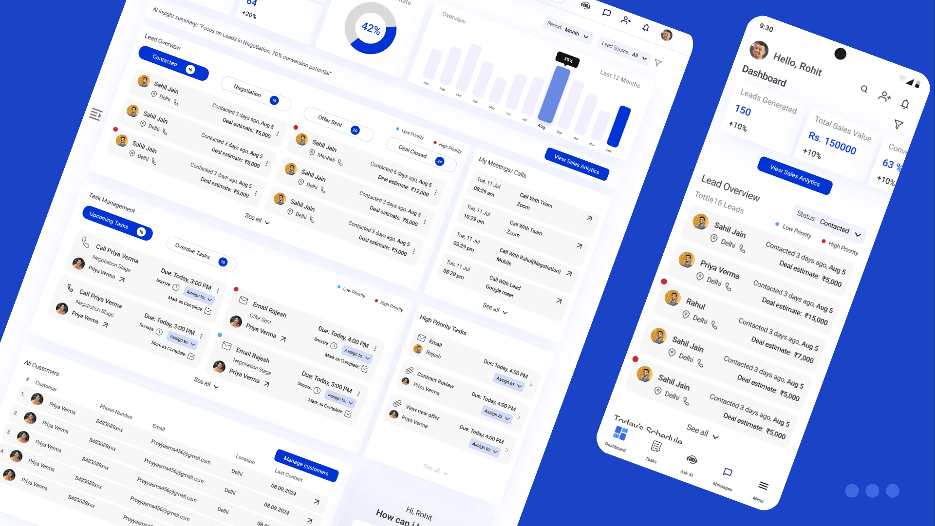
The role of a Lead Dashboard
Within a CRM, the dashboard is where a sales rep begins and ends their day. It is the control room that shows the state of their pipeline, highlights progress toward targets, and reminds them of tasks and follow-ups. A good dashboard not only reports data but guides action: which lead to contact first, which deals need attention, and what meetings are coming up. For salespeople, especially those on the move, the dashboard is less a report and more a daily assistant.
The role of a Sales Representative
Sales reps are the frontline of any business, responsible for building relationships, pitching solutions, and closing deals. Their work is demanding, juggling dozens of conversations, updating records, and meeting aggressive targets. Much of their effectiveness depends on how quickly they can prioritize and act. When tools slow them down or bury crucial information, the result is lost deals, frustration, and burnout.
Current Challenges in Sales Workflows
Sales teams using existing CRM dashboards often encounter:
Cluttered layouts where too many widgets and numbers compete for attention.
Unclear prioritization of leads, leaving reps unsure who to contact first.
Missed follow-ups because tasks and reminders are scattered or hidden.
Poor mobile usability with stripped-down features instead of meaningful adaptations.
Fragmented collaboration, forcing reps to switch to external chat or email tools.
Competitor Landscape
To ground the design, I studied common CRM products. Each offered strengths, but also recurring weaknesses that left room for improvement.
Competitor | What works well | What doesn’t work well |
|---|---|---|
Salesforce | Comprehensive ecosystem, deep customization, advanced reporting. | Overwhelming for new users, cluttered dashboards, steep learning curve. |
Zoho CRM | Affordable, wide set of integrations, flexible modules. | Interface feels dated, navigation is clunky, mobile app is limited. |
HubSpot | Clean UI, strong marketing + sales integration, easy onboarding. | Dashboards get crowded as data grows, free tier heavily restricted. |
Freshsales | Simple interface, good automation for follow-ups, quick setup. | Limited customization, weaker analytics compared to bigger players. |
Pipedrive | Strong visual pipeline, intuitive drag-and-drop lead stages. | KPI tracking is basic, collaboration features are minimal. |
User Persona

What the user should be able to do
At a minimum, a sales rep should be able to glance at their KPIs, see where each lead sits in the pipeline, track and complete tasks, and access AI-powered suggestions to guide next steps. They should also be able to collaborate with teammates through quick updates, and all of this should translate smoothly between desktop and mobile contexts.
Ideation & Design
To translate the research insights into design directions, I began with How Might We questions that reframed user frustrations into opportunities for solutions. This exercise ensured that the information architecture directly addressed user needs instead of just mirroring existing CRM patterns.
How Might We
How might we help sales reps prioritize leads without overwhelming them with data?
By introducing a clear lead pipeline with stage-based categorization, reps can instantly see where each lead stands. Adding AI-priority flags highlights the most promising opportunities, making decision-making faster and easier.How might we make follow-ups and tasks impossible to miss while keeping the dashboard lightweight?
Tasks and meetings are given a dedicated space on the dashboard, separated into upcoming and overdue categories. Quick actions like “mark complete” or “reschedule” reduce friction, ensuring follow-ups are always visible and manageable in seconds.How might we adapt the dashboard so it feels equally powerful on mobile as it does on web?
The solution was to design a modular, card-based system that naturally stacks into a single column on mobile. KPI cards become swipeable, while task lists and pipelines are restructured into scrollable sections for quick, touch-friendly access.How might we embed AI insights in a way that feels actionable, not intrusive?
Instead of generic notifications, AI provides concise recommendations such as “Focus on leads in Negotiation—70% conversion potential.” These insights appear contextually alongside KPIs and tasks, helping reps act on them immediately.How might we support team collaboration without forcing users to switch apps?
A lightweight messaging utility is integrated into the dashboard, allowing reps to share quick updates, delegate leads, or flag issues within the same interface. This reduces context switching and keeps communication aligned with workflow.
Information Architecture

03
Conclusion
04

