01
Designing A Flexible Dairy Subscription Model

Project Brief
Designed a smart dairy purchase and subscription experience for to make daily milk delivery more flexible, intuitive, and user-centric.
Problem
Managing a consistent milk supply can be surprisingly difficult for working professionals, students living alone, and elderly customers. Most existing dairy subscription services are too rigid—offering limited flexibility to pause, reschedule, or adjust deliveries based on changing needs. This leads to frustration, product wastage, or complete drop-off from the service.
Solution
I designed an end-to-end customer subscription experience to make it more flexible, intuitive, and responsive to real-life scenarios. The outcome included a new subscription model with customizable delivery controls, clearer onboarding, and improved communication touchpoints.
Duration - 8 weeks
Role - UX/UI Designer
Team -Developers, Product Manager, Graphic Designer, Testers
02
Process
Research
I conducted user interviews and analyzed existing dairy subscription platforms to identify common patterns and pain points. Key findings included:
Current Situation
India’s milk delivery system still heavily relies on informal methods. Existing digital platforms are either too rigid, complex, or not locally trusted.
Most people either:
Rely on local vendors (with inconsistent service),
Use traditional subscriptions (fixed quantities, no pause/edit options),
Or walk to nearby stores every day—time-consuming and unreliable.
Challenges Faced
Other then Wastage when people traveled, Shortages when consumption changed and And general anxiety around “milk management, people faces problems like:
Lack of Flexibility: Users can't easily pause, skip, or change deliveries.
No Control: No visibility into delivery schedule or payments.
Poor Communication: No reminders, confirmations, or customer support.
Limited Tech Use: Older adults struggle with complex apps.
Trust Gap: Local brands struggle to compete with digitized startups like Supr Daily.
Competitor Overview
Competitor | Strengths | Weaknesses |
|---|---|---|
Supr Daily | Polished app, flexible subscription model | Only available in metros, not personalized |
BB Daily | BigBasket ecosystem, good UX | Confusing for elderly, many steps |
Local vendors | Trust-based, easy phone coordination | Not scalable, no tech, cash only |
Country Delight | flexible subscription model | Very Compact Ui, very transparency in subscription |
User Personas
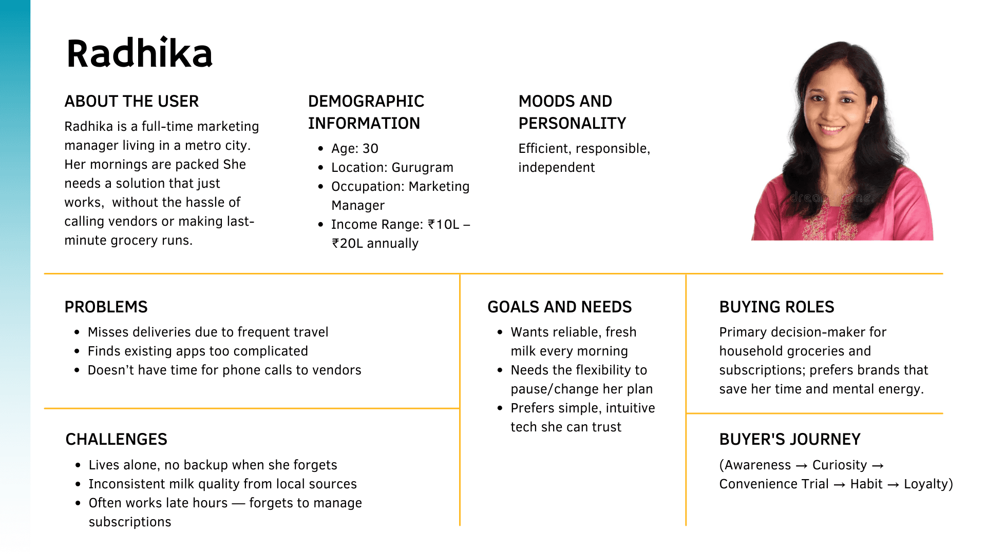
Other Primary user groups include:
Aman, 22, Student, lives alone, often forgets to order milk. Needs reminders and easy pause options.
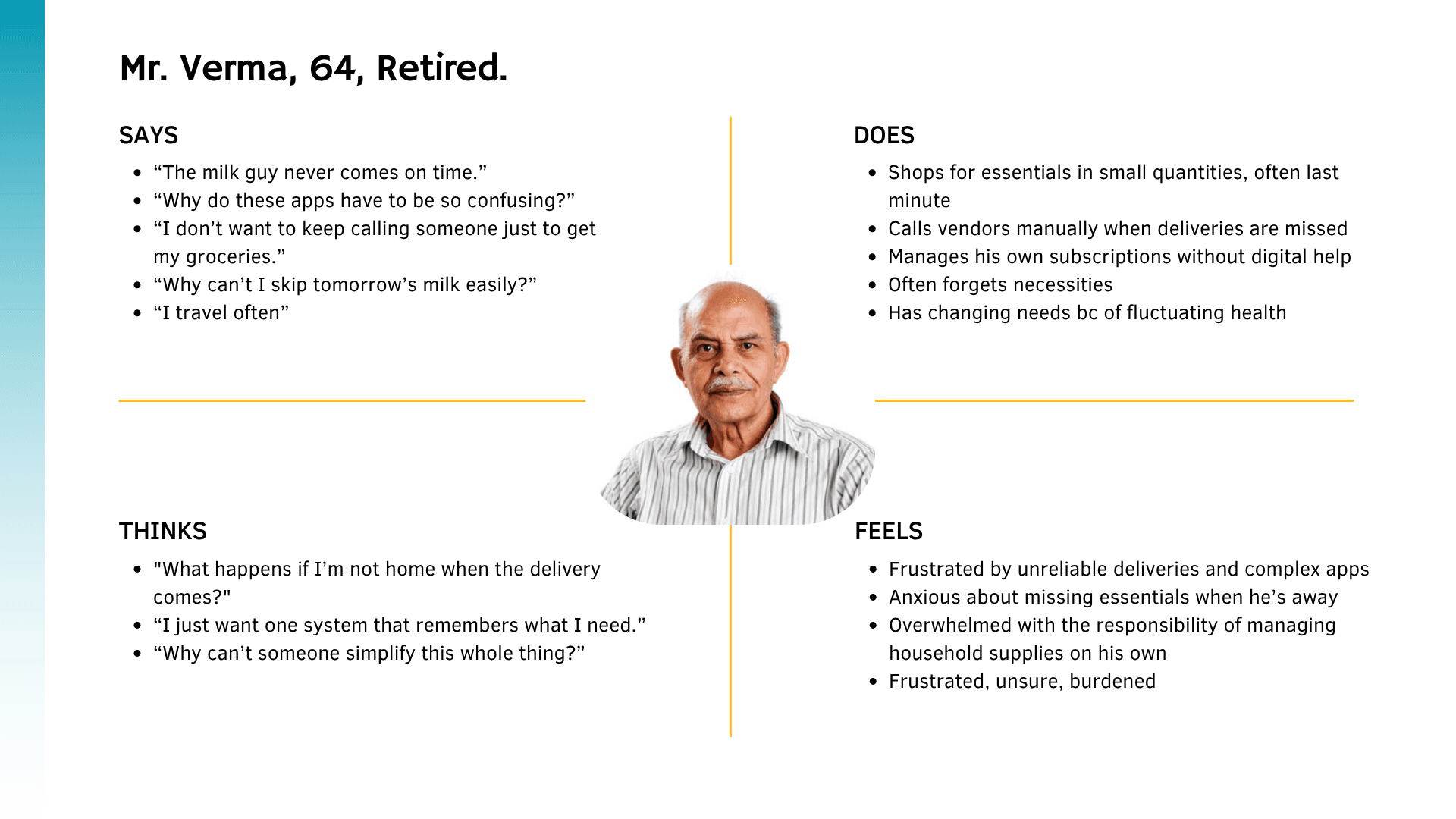
Mr. Verma, 68, Retired. Wants consistent supply, minimal interface complexity.
Empathy Map
Ideation
To tackle the chaos of milk delivery logistics and the user-side subscription flow, we started framing problems to spark solution-thinking grounded in real user needs. using "How Might We" questions.
How might we make milk ordering feel as smooth and predictable as possible?
→ Solution: A flexible subscription model with options for daily, alternate-day, and fully custom delivery schedules. Users can also pause/resume seamlessly.
How might we let users manage delivery interruptions (vacations, changes) without anxiety or customer service calls?
→ Solution: A “Vacation Mode” to pause subscriptions with calendar-based selection for start and end dates — no back-and-forths, just tap and done.
How might we reduce drop-offs during order placement, especially for one-time buyers?
→ Solution: A clean “Buy Once” flow, directly from product cards. Wallet balance checks and recharge prompts are tightly integrated to prevent transaction failure loops.
How might we help users feel in control of their milk supply without overwhelming them with options?
→ Solution: Designed clear hierarchy in product cards and screens — minimal distractions, quick toggles between “Add” and “Subscribe,” and summary screens that reflect delivery details transparently.
How might we ensure the subscription model doesn’t feel like a trap?
→ Solution: Built-in affordances for users to pause, edit, or cancel subscriptions any time. The UI copy reinforces flexibility (“Pause instead of cancelling”).
Minimum Viable Product (MVP)

Flexible Scheduling Options + vacation mode
Users could start, pause, or resume their milk delivery directly from the app, without needing to call customer support.Quick Calendar widget
We redesigned the quick calendar, which was available at different points in the interface and provided a review of delivery scheduled for every day.Clearer Subscription Status + Controls
Users could see their current subscription status at a glance and take direct actions like cancelling or modifying delivery schedules.Address & Delivery Time Picker
Basic user profile setup with delivery address and preferred time to ensure operational feasibility.Mobile-first Interface
Since most users interacted via mobile, the MVP was designed primarily for small screens, ensuring clarity and ease of use.
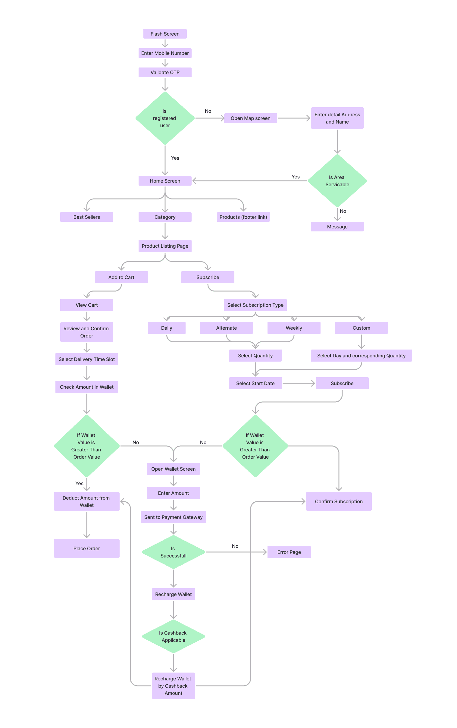
Task Flow ( Order Creation & subscription flow )
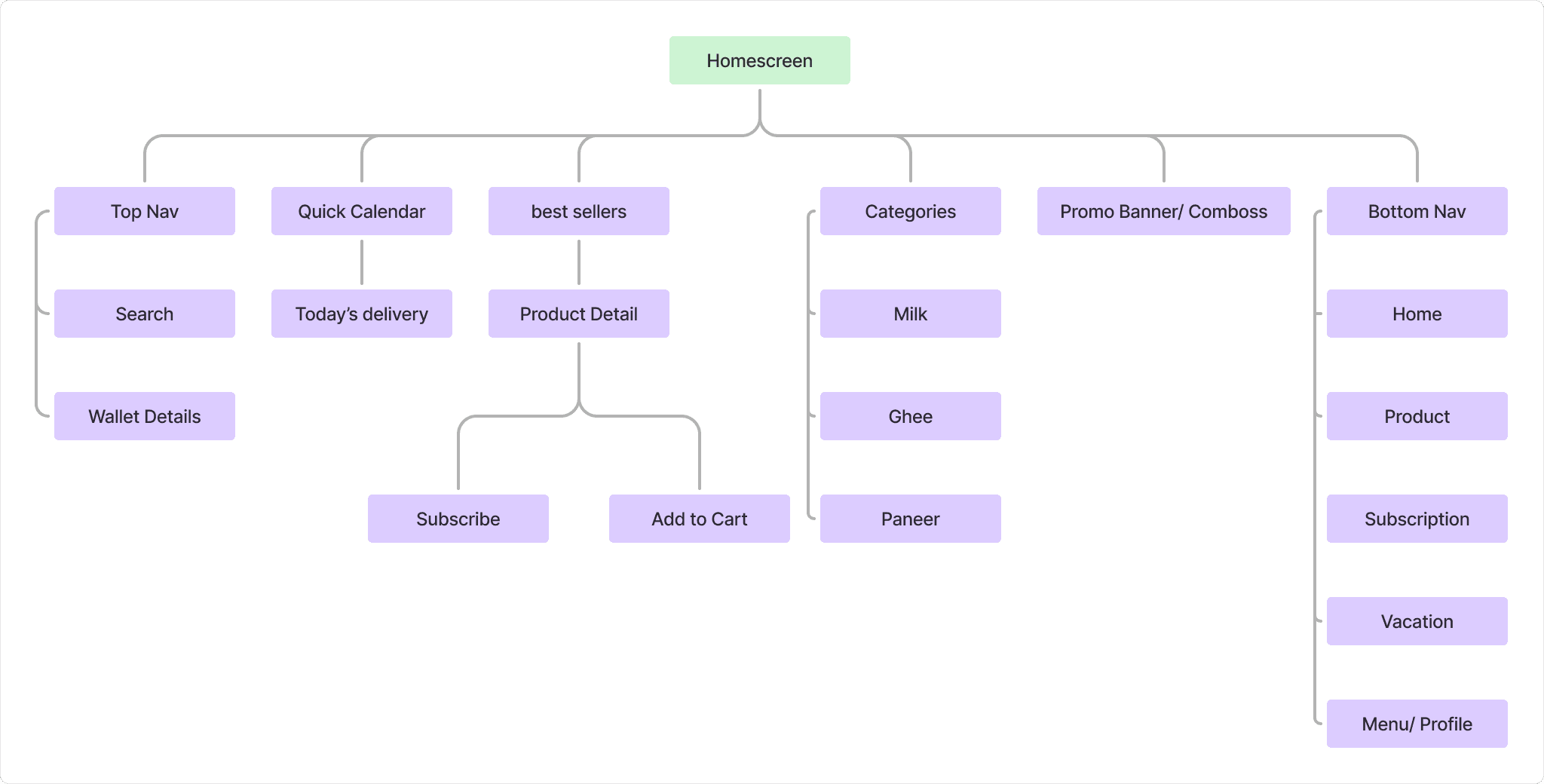
Information Architecture (Home Screen)
Design
After aligning on the MVP and prioritizing flexibility and ease, I moved into designing key touchpoints of the subscription experience.
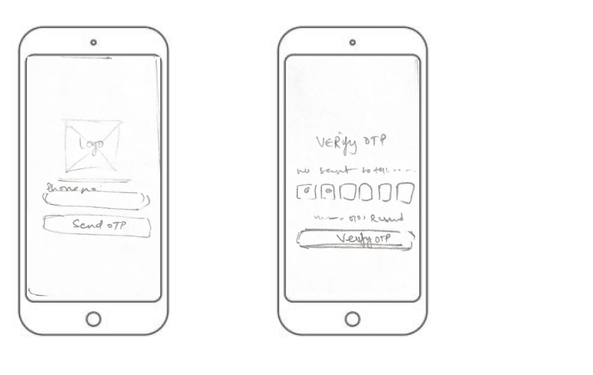
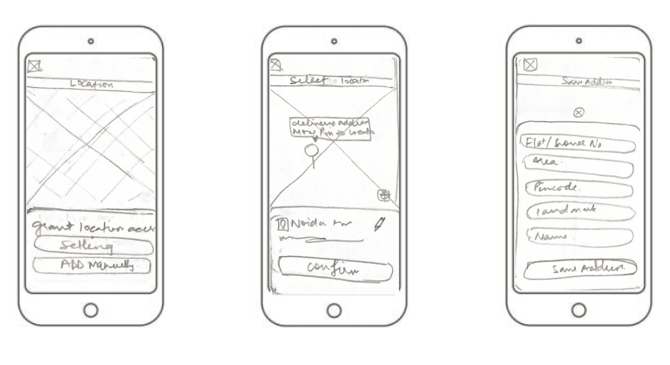
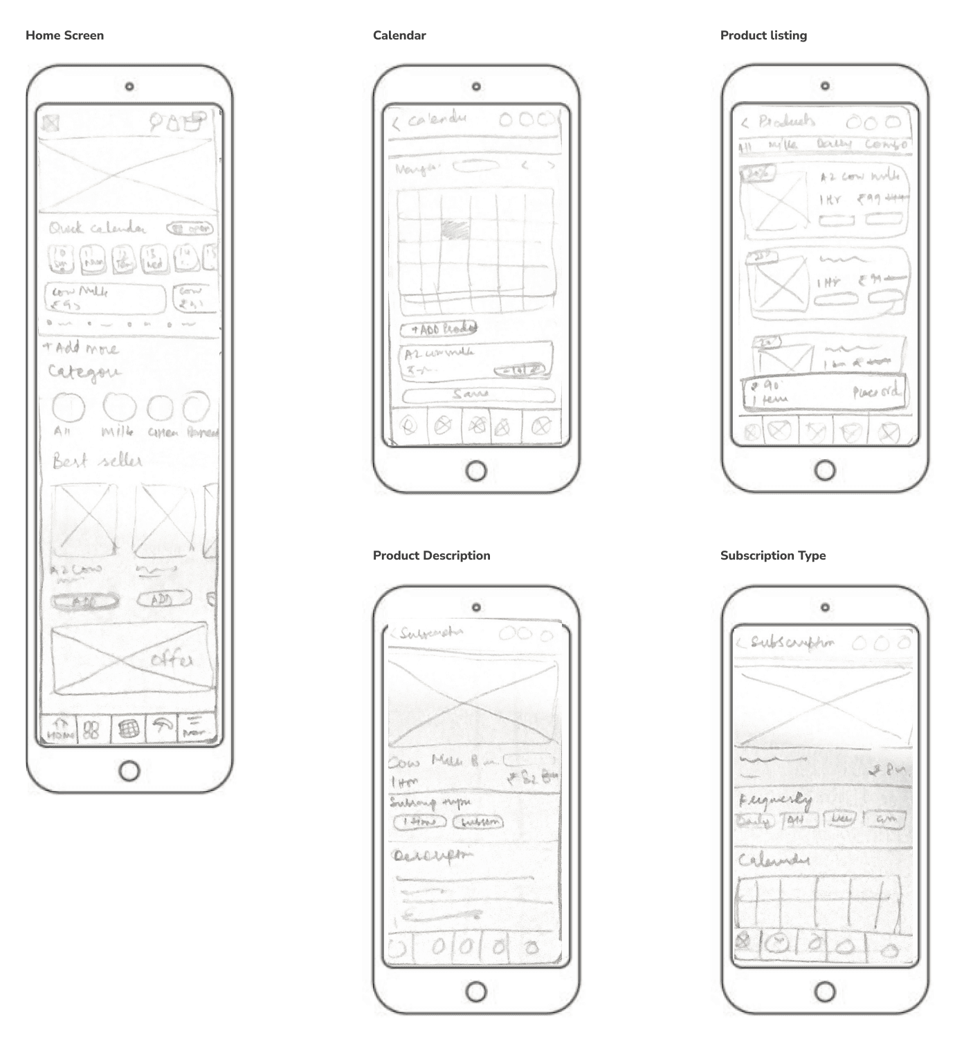
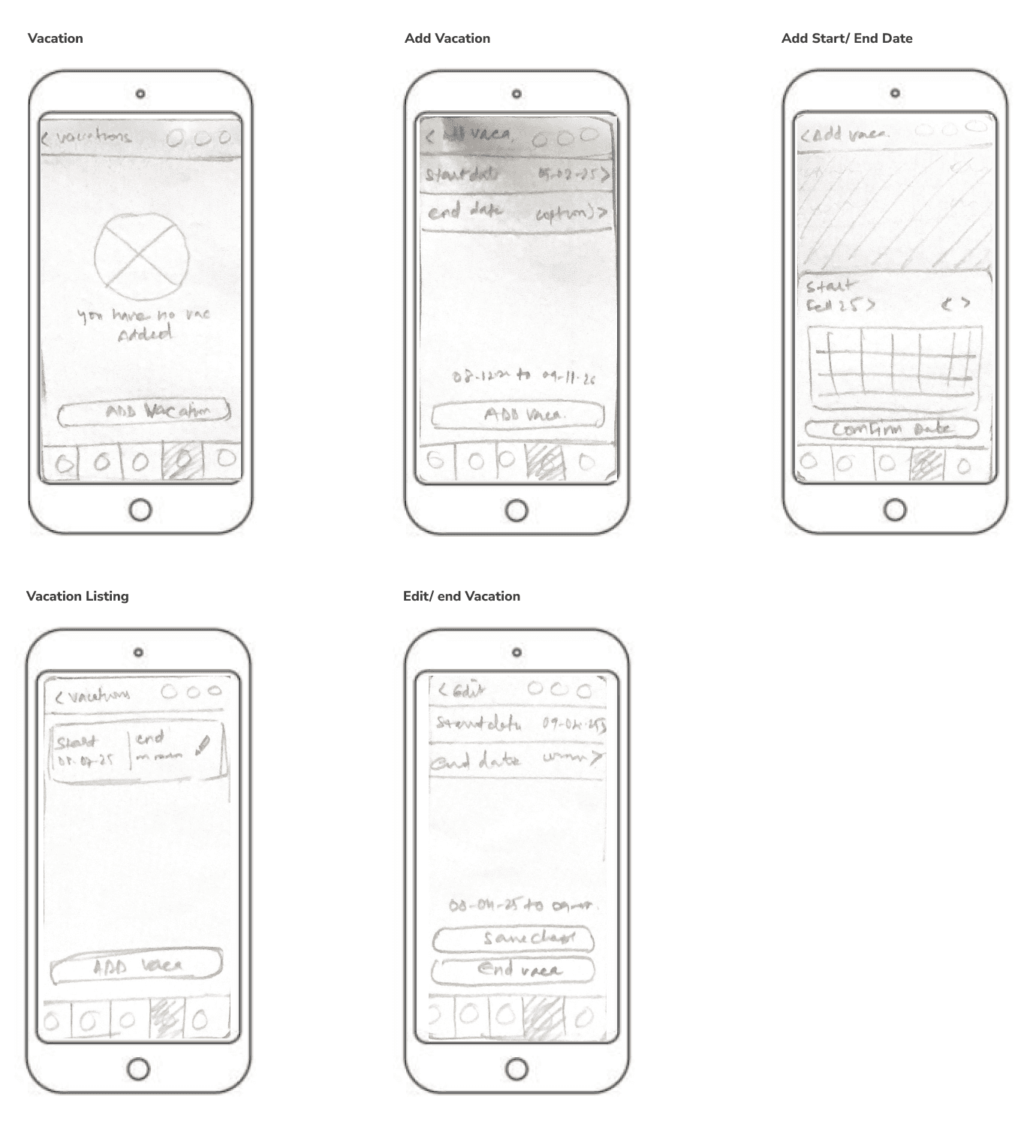
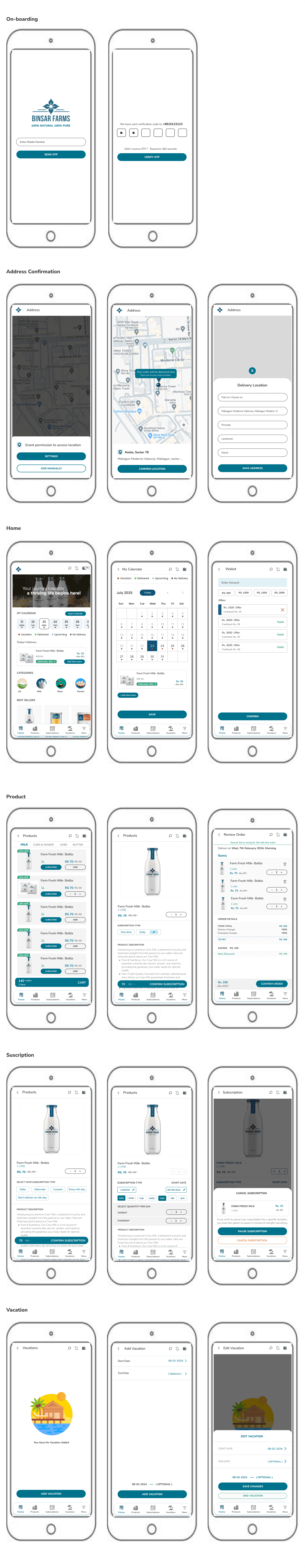
Paper Wireframes
Iteratively designed wireframes to test layout and navigation, focusing on clear visual hierarchy and intuitive interactions and to map out core user flow.
Login + Verification
Location Access + Address Confirmation
Home + Calendar + Product
Add/ edit Vacation
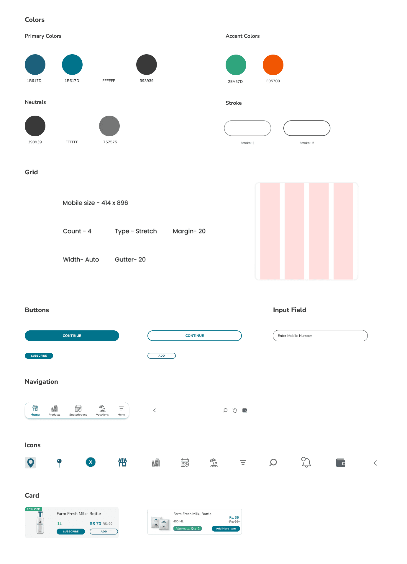
Design System
I created a lightweight system using Figma styles and components to support modularity. This ensured that UI elements like quantity selectors, toggle switches, and date pickers could be reused.
Key elements included:
Color palette inspired by natural dairy tones (cream, grass, rust)
Rounded, minimal icons and typography for clarity
Components for scheduling, calendar input, and action modals.
Final UI and Prototyping


03
Conclusion
Lessons Learned
Subscription models require clear communication – Users need transparency on pricing, modifications, and cancellation policies.
User trust is built through UX – High-quality visuals, clear CTAs, and easy navigation make a huge difference.
Iterate based on feedback – Small UI tweaks based on testing significantly improved usability.
This project not only refined my skills in e-commerce UX/UI but also deepened my understanding of designing for subscription-based models. Looking forward to more impactful design challenges!
04

