01
A B2B platform's website Redesign

Project Brief
ShoutOutCoin is a workplace recognition platform that allows employees to give and receive anonymous feedback and earn rewards. I redesigned the public landing page to improve clarity, visual hierarchy, and conversion by better communicating the product’s value to both HR teams and employees.
Problem
the current landing page design falls short in communicating this value clearly.
Key Issues Identified:
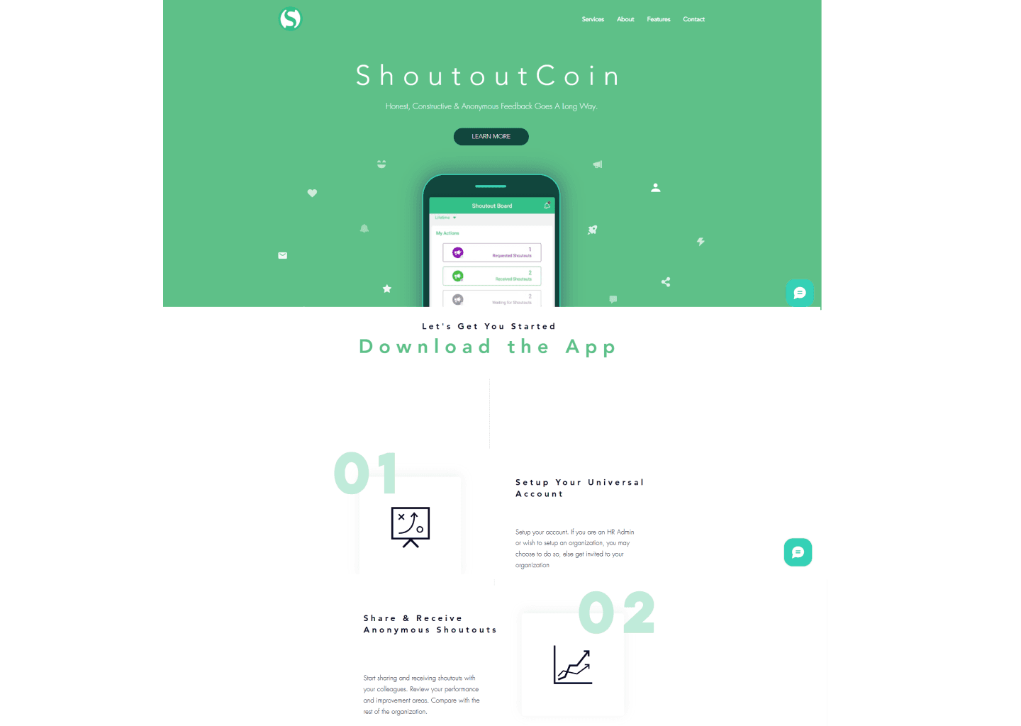
Lack of hierarchy: The page feels visually flat. Important elements like the feature list and value proposition don’t stand out and are easy to miss.
Too much negative space, causes lack of focus
Unclear value proposition: The landing page doesn’t explain the product or how it benefits users at a glance. Visitors may struggle to understand what ShoutOutCoin actually does.
Weak call to action: There is no prominent, consistent CTA guiding users toward a primary action.
Ineffective use of color: The overuse of green makes the design monotonous and tiring for the eye. A more balanced palette could create better visual flow and highlight important actions.
Generic branding: The current logo and overall brand identity feel generic and lack a strong connection to the product’s purpose.
Hidden features: The feature list is buried low on the page, meaning users may leave before discovering the product’s key benefits.
Outdated contact section: The contact form looks dated and disrupts the otherwise modern intent of the site.
Overall, even though the website looks clean but it struggles to standout without clarity, visual engagement, and effective communication of ShoutOutCoin’s unique value. A redesign would need to simplify the information hierarchy, modernize the visual identity, and create a more engaging, conversion-focused landing experience.
Design Goals
Clearly explain what ShoutOutCoin does
Make it obvious who it’s for (HR & employees)
Improve trust and credibility
Guide users toward sign-up or demo
Create a modern, scalable brand feel
Role: UI/UX Designer
Scope: UX Audit, Information Architecture, Landing Page Redesign
Timeline: 1–2 day design sprint
02
Process
Understanding the Product
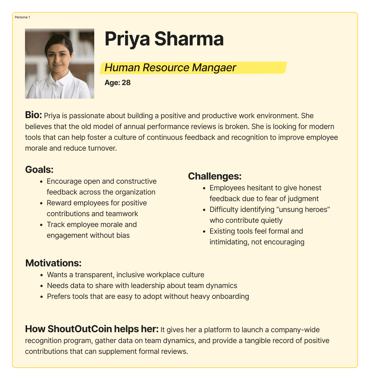
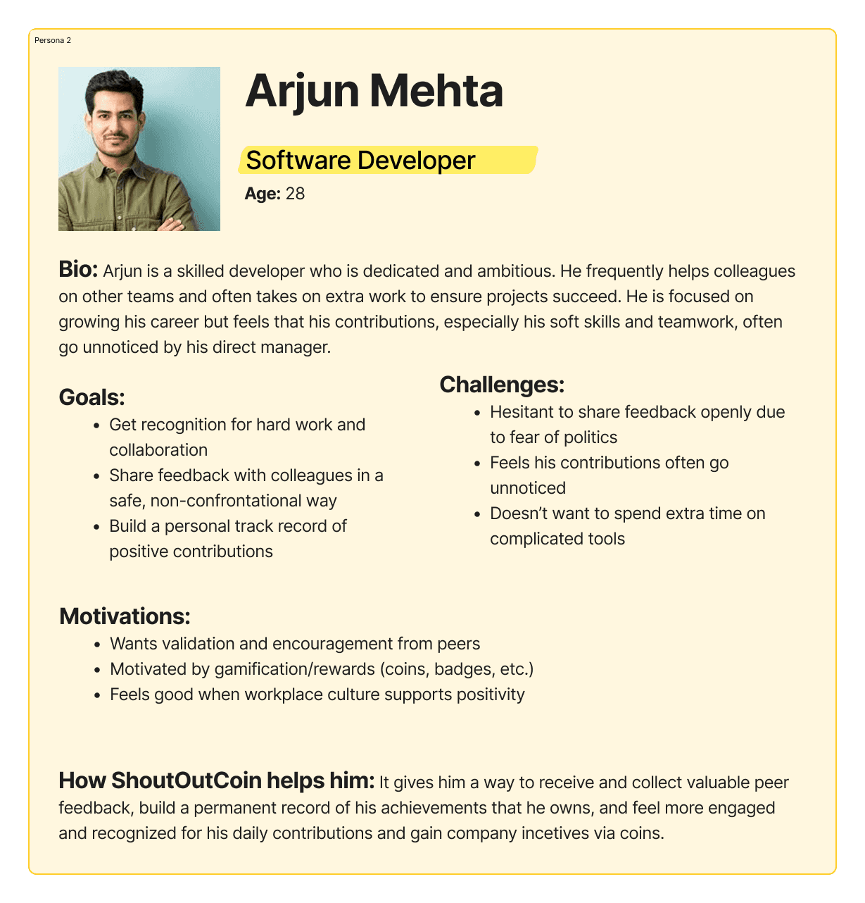
Ambitious employees need a way to get tangible, verifiable recognition for their collaborative work, because traditional performance reviews often fail to capture these crucial, "invisible" contributions, hindering their career growth.
Simultaneously, HR leaders (like Priya) need a modern tool to foster a positive culture and gather real-time data on team dynamics, because outdated feedback models lead to employee disengagement and talent loss.
What ShoutOutCoin offers
Anonymous shoutouts
Coins & rewards
Lifetime achievement profiles
Trend analysis for HR
Two user types
Employees → want recognition, growth, and rewards
HR teams → want engagement, culture insights, and retention
Market Review
To understand how similar B2B and employee-recognition platforms communicate their value, I reviewed several SaaS landing pages in this space. I looked at how they handled clarity, trust, feature explanation, and conversion.
Patterns I noticed:
Most successful B2B tools clearly separate employer value and employee value
They use visual product previews to reduce ambiguity
They highlight social proof early (logos, testimonials)
They keep CTAs visible at all times
User Personas
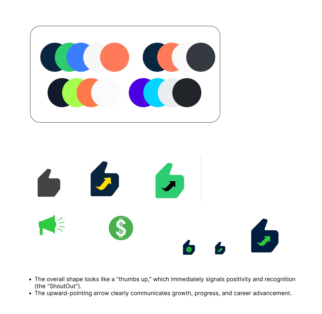
Branding & Visual Design
The existing ShoutOutCoin website relied heavily on a single shade of green, resulting in a flat and tiring visual experience. The brand also lacked a distinctive identity — the logo, typography, and layout didn’t communicate trust, clarity, or modernity, which is critical for a workplace product.
My goal was to evolve the brand into something that feels:
Professional yet warm
Trustworthy yet energetic
Rewarding, not corporate
Instead of using green everywhere, I:
Kept green as the reward and action color (coins, CTAs, success states)
Introduced a deep navy for text and structure to improve readability and trust
Used soft neutrals and light blues to create breathing room and visual flow
I refined the logo to:
Use a bold, simplified mark
Combine the idea of approval (thumbs-up) with growth (upward arrow)
Work across app icons, website header, and UI surfaces
Strategy
structured the landing page as a story: Value → Understanding → Trust → Action
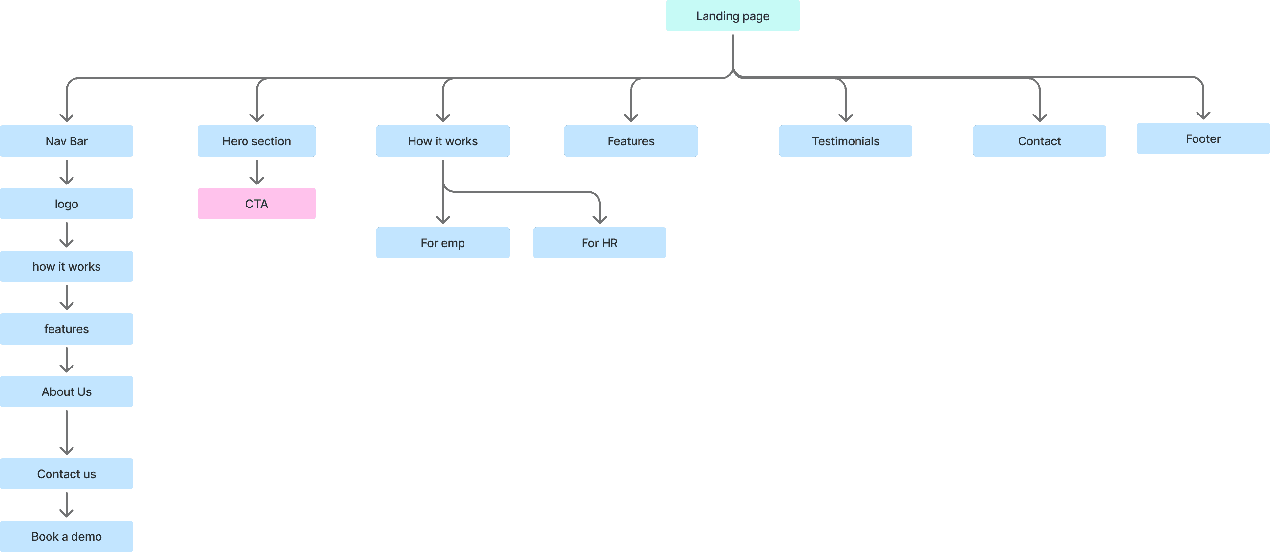
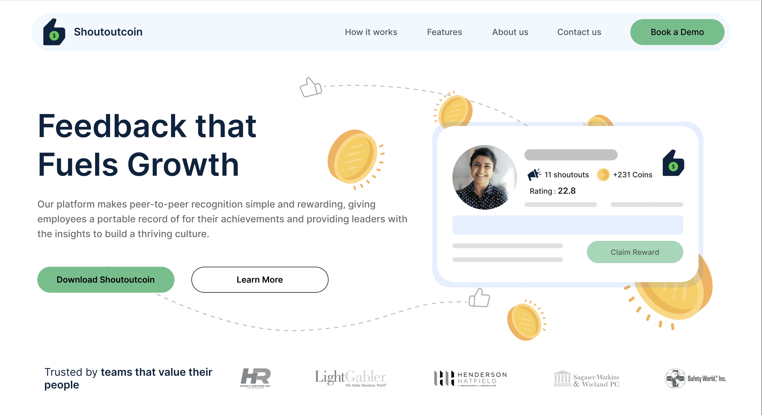
Clarify the Value Proposition
The hero section had to immediately answer:
What is this?
Who is it for?
Why should I care?
So I:
Simplified the headline
Added contextual visuals and iconography
Introduced strong CTAs
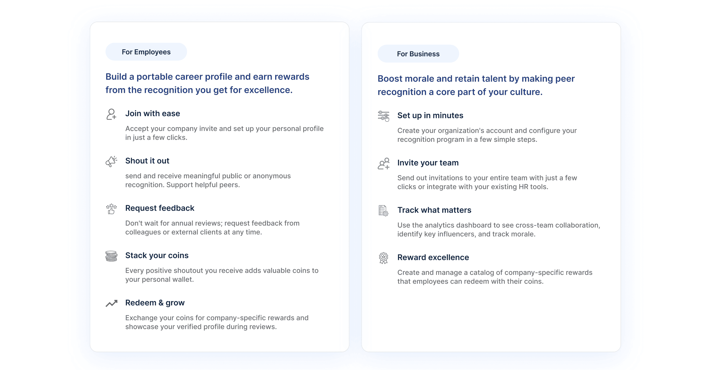
Split the Experience for HR & Employees
Since ShoutOutCoin serves two different users, I created:
A “For Employees” flow
A “For Business” flow
This allowed each audience to see themselves reflected on the page.
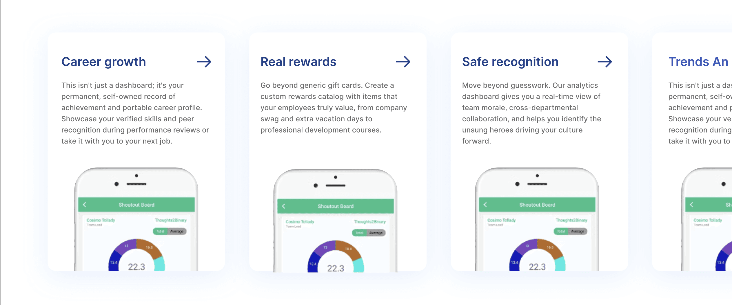
Turn Features into Benefits
Instead of listing features:
Lifetime Dashboard
Anonymous Shoutouts
Coins
I reframed them as:
Career growth
Safe recognition
Real rewards
Build Trust Before Asking for Action
I added:
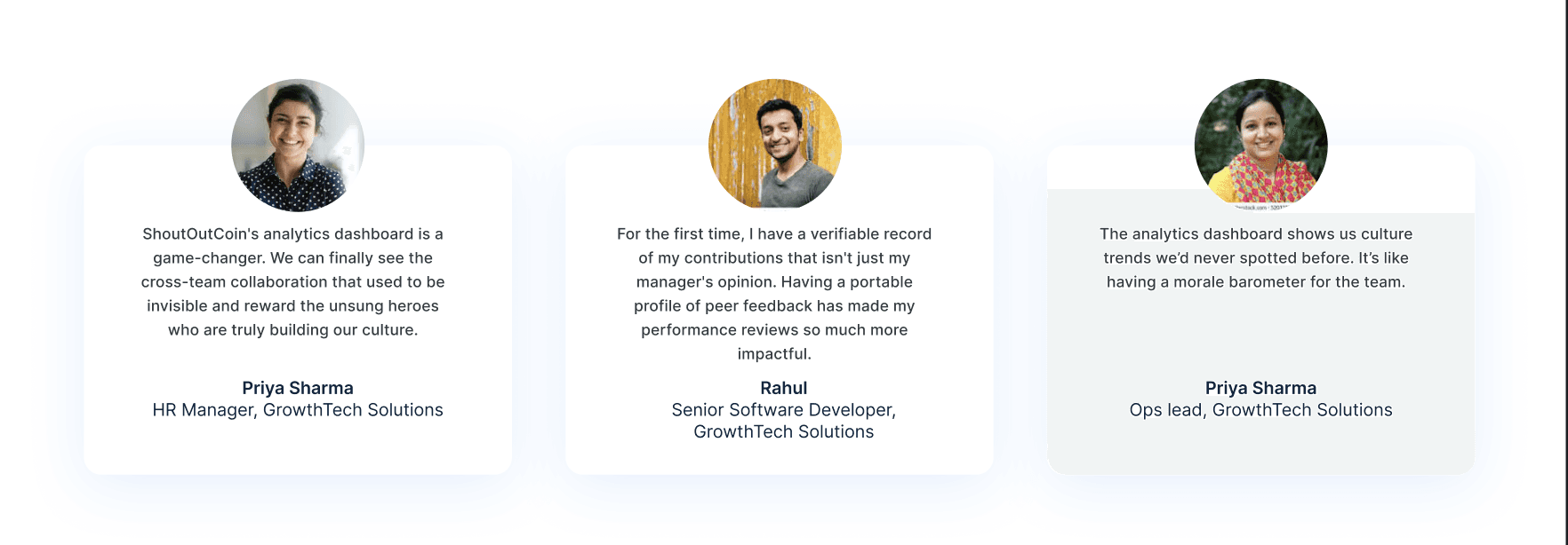
Social proof
Testimonials
Familiar UI patterns
So users feel safe before clicking “Book a Demo” or “Download”.

03
Conclusion
The redesign makes the product easier to understand, more trustworthy, and more conversion-focused, positioning ShoutOutCoin as a modern workplace recognition platform.
Reflections & Learnings
This project was completed as a fast design sprint, which pushed me to prioritize clarity and impact over perfection. Working within a short timeline helped me focus on the most critical UX questions:
What is this product? Who is it for? And why should someone care within the first few seconds?
One of the key learnings was how much visual hierarchy influences understanding. Simply reorganizing content and adjusting spacing, typography, and contrast dramatically improved how easily the product could be understood.
I also gained a deeper appreciation for how branding and UX are tightly connected. Refining the color palette and logo wasn’t just a visual exercise — it directly affected trust, usability, and how “real” the product felt.
With more time, I would:
Design responsive mobile and tablet versions
Add micro-interactions and motion to enhance engagement
Conduct usability testing to validate assumptions and refine the flow
Expand the brand system into a full design language for the product
Disclaimer
This is a conceptual redesign created for portfolio purposes. It does not represent the current live product.
04

